Wednesday, March 30, 2005

About Oasisnyc

Well when I was putting my presentation together on the Williamsburg bank, I initally tried to use the Oasisnyc site. The site wouldn't respond everytime I went to it except for when I was done getting my pictures from GOOGLE for the presentation. It decided to work when I finally gave up on it. I found it kind of hard to find what I wanted on there anyway. Google was very helpful as usual.

Tuesday, March 29, 2005

If I was an art director la, la, la, la, la, la...

Click here for photo!


If I was an art director with a story for the fort greene area I would probably chose Fiorenzo Borghi as my photographer out of the Bill Charles site. I would choose him because the majority of the photographers on the site are either fashion photographers or they mainly take product shots. He's more of an outdoors photographer that mainly takes pictures of the scenery and the people that are in the photos are off to the side or in a corner of the shot. I would use his approach because the area will be more important than the people that are in it.

Monday, March 28, 2005

Presentation Critique

The person that I had to write on was Elizabeth Tan. I feel that she did an excellent job on her presentation of the BAM. It was very informative and interesting. She did good detective work with finding out the extra little pieces of information on the typography of the building. She found out the origins of the idea of "cut off" letters even though the information wasn't easily obtainable. She also explored the building and realized that the BAM went through a branding crisis where different typefaces can be seen around the building. The photo that had a lasting effect on me was the one that she took on the side of the bam building. It was BAM engraved in some kind of sans serif font. When I saw that photo I just kept thinking how could they even consider this type face as an option. I just found it to look a bit childish for the BAM. Overall, Elizabeth did a great amount of research for the presentation, hit a couple of key points and was very well organized. The only suggestion that I have is for her to keep up the good work!

Down on 8th street


This is a photo that I took about a month ago when I was down on 8th street in the village. It was a window display where the mannequins actually had some kind of personality and character to them.

the sign


I was also in the BAM area when I took this photo. At this point I had began to realize just how beautiful neon lights really photograph

More lights


This is another photo that I took when I was exploring the BAM area at night

Tuesday, March 15, 2005

A Photo that changed the world

Click here!

This photo named bimingham is a very recognizable photo. When I see it I immediately think of the civil rights movements. I think that this is one of the many photos taken at that time that shows the canges that colored people had to go through during the struggle for racial equality. I feel this definately changed the world because other people were actually able to see how colored people were being treated in the south wheter they were there to see it for themselves or not.

lights, camera...


Well I usually don't shoot at night,but it just happened to get dark before I expected it to. Most of the pictures I took didn't come out but the ones that did were photos of lights. (is that strange or what?) This one happened to be my favorite out of them all because the neon lights are reflecting off of the flower pots and contrasting with the flowers as well.

night time


This is another one of my favorite photos that i took at night. I like it because of it being pitch dark out but yet, you are still able to see what time it is

Wednesday, March 09, 2005

Berenice Abbot

Click here!

The photo on this page is my favorite one out of the photos by Berenice Abbot. The tree and the shadow that it creates gives the photo and erie feel. When you read the text you realize that it was a potter's field in Washington Square Park. She managed to make the photo look like what it really was.

Williamsburg bank


This is one of the best photo's that I took this week . I found that it was kind of difficult to take good pictures on a sunny day. The sun tends to give pictures a hazy look. The theme of some of my photos were the Old brooklyn vs. the new Brooklyn. Some of these photos I have taken have subjects like a brownstone next to the mall.

Storm


This is a picture that I took out of disbelief when we had the big snow storm. I haven't seen so much snow since the blizzard of 96'!

Tuesday, March 01, 2005

Gallery Exhibit

On Wednesday February 23rd, our class went on three photo gallery exhibits. These three exhibits had very different themes to them. There was one that had different bedroom furniture from possibly different countries and time periods. They made you want to know more about the person that slept in them as well as more about the way the rest of the house may have looked. This exhibit also had photos from modern day homes that used warm colors that seemed to have given life and a homey feeling to them. The third part of that exhibit looked like it was done in some kind of abandoned building and left the viewer with a cold feeling of loneliness especially in the photo where the paint was peeling off of the ceiling and a single chair was left in the middle of the room. The second exhibit was at the Luhring Augustine gallery and the theme of that exhibit seemed to be the artist transforming famous paintings and etchings by Goya into a work of his own. The third exhibit which was at the Yancy Richardson gallery had more of a theme of taking reality and making it into a painting by using bright colors with high contrast. Some of the photos would have to be seen from a close range so that you could see that they are not paintings. Out of these three exhibits. I chose to write on Morimura. I found his work to be the most striking out of them all.
I found Morimura’s photos to be very interesting because they used the colors to tell the story. In the photo named “fated to wait for someone’s death”, everything from the background of the photo to the clothing of the subjects were dull colors. The dull colors immediately make the viewer aware that the mood of this photo is not a happy one. The colors prepare you for the morbid nature of the photo in which the woman is holding the heart of a dead man. I feel that the use of color helps to convey the overall main idea of the photo.
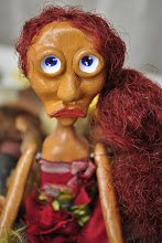
The thing had initially attracted me to his work was that they were recognizable masterpieces that were remade with a totally different approach Not only does Morimura redo other peoples work, he poses in the photos as the leading subject. I think it is very creative of him to take somebody’s work and transform it by using different media and elements. If you were to put one of his photos next to one of Goya’s originals you would see that they share the same subject manner and composition but you would realize that they feel different. With Goya’s pieces you get a feeling of roughness and more of a harsh feeling with them I guess because of the fact of them being etchings. In Morimura’s photos, you get a feeling of quirkiness because of Morimura posing as the subject whether they are male or female. The titles of these etchings as well as the photos are quirky as well. The title becomes like that funny joke that that makes you laugh at it hours after you hear it making you think of the photo that it belongs to more often then others. I feel that Morimura’s work is creative in a sense that he creates elaborate creatures for some of his photos. This is what makes him a haptic photographer to me. He doesn’t just go out and take a picture of his surroundings, he creates and gives emotions to them. The facial expressions on these creatures are so realistic that they seem to be alive. This mixture of different elements are what I believe makes his images arrestingly beautiful. I hope that some day I will be able to create images as crisp and sophisticated as Morimura. His photos are so strong that they don’t need to be seen in a series. They are able to stand alone because each one of them tells a different story. You are able to understand by the picture by itself as well as the text that goes along with it.